The Office Ratings
TidyTuesday Week 12: The Office
This week’s tidytuesday data came from one of my favorite TV shows of all time: The Office! The schrute package (named after one of the main characters) contains the scripts of all episodes from a total of 9 seasons. What is particular interesting is that the authors of the package already divided the scripts in a way that each line of a character in the show is one row in the data – so there’s plenty of data to play around with! Let’s see what we can find out!

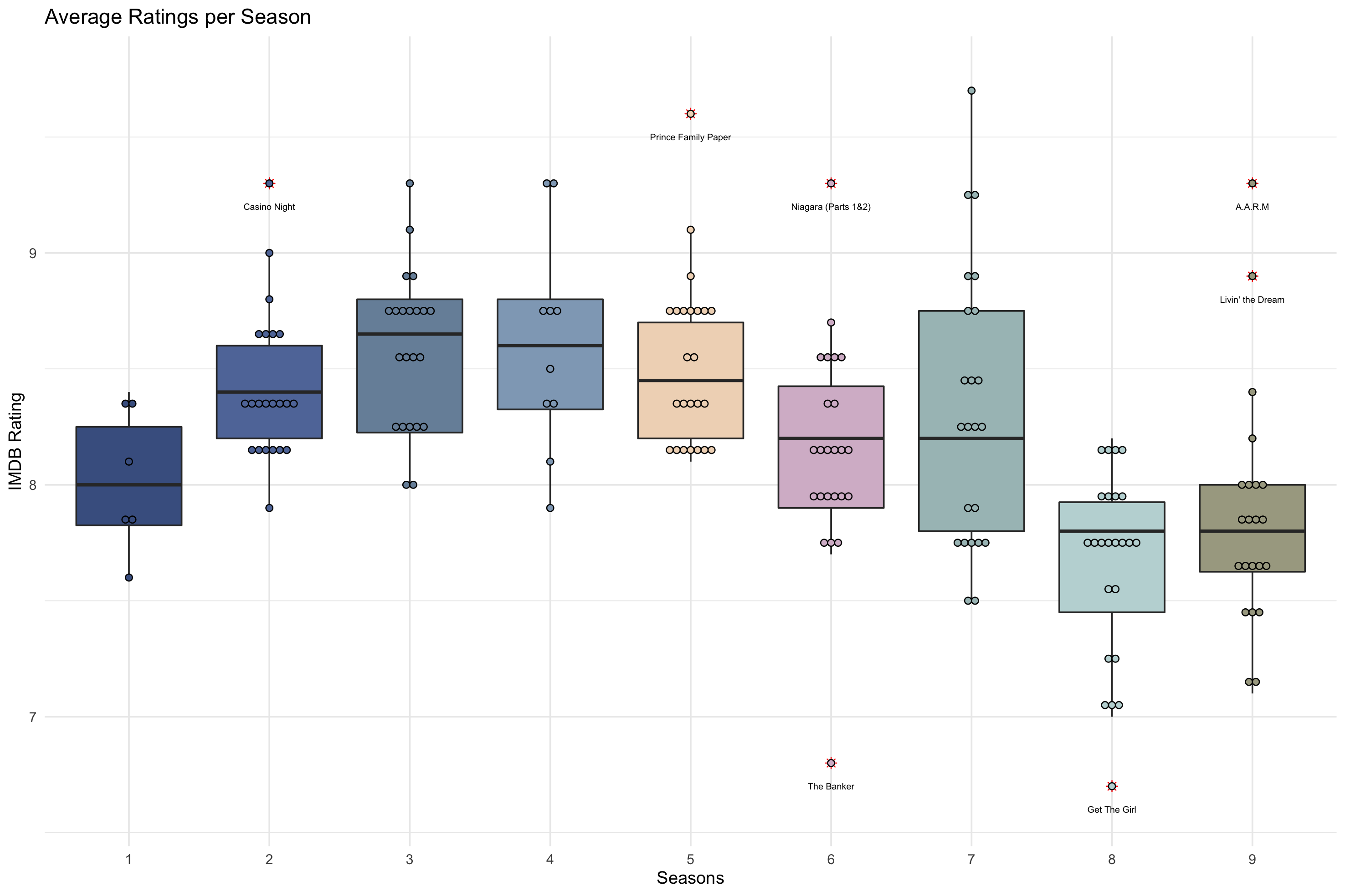
In addition to these scripts, the tidytuesday data also provides a dataset on the IMDB ratings for each episode. The first thing I did was to look at the IMDB data to see how ratings are distributed over time. I use a simple boxplot using geom_boxplot() as the basis and added some features that increase the information that we can read from the graph.
The first thing is to add the distribution of ratings using geom_dotplot(). As it always interesting to see the outliers in a boxplot (and especially if the tell you which episodes were particularly liked or disliked by viewers), I’ve added an identifier for the outliers using the is_outlier() function felow and add it to the labels in geom_text().
# function to identify outliers
is_outlier <- function(x) {
  return(x < quantile(x, 0.25) - 1.5 * IQR(x) | x > quantile(x, 0.75) + 1.5 * IQR(x))
}
The rest of the code is just to make the plot more visually appealing where I used, for the first time, the palatteer package which provides a maginificent colleciton of different color palettes from different packages. I used afternoon_prarie from the nord package for the boxplot below.
# function to identify outliers
is_outlier <- function(x) {
  return(x < quantile(x, 0.25) - 1.5 * IQR(x) | x > quantile(x, 0.75) + 1.5 * IQR(x))
}

# create the boxplot graph
office_boxplot <- the_office %>%
  group_by(season) %>%
  mutate(outlier = ifelse(is_outlier(imdb_rating), imdb_rating, as.numeric(NA))) %>% # specify outliers
  mutate(to_label = ifelse(!is.na(outlier), title.x, NA)) %>%
  ggplot(aes(as.factor(season), imdb_rating, fill = as.factor(season))) +
  geom_boxplot(
    outlier.colour = "red",
    outlier.shape = 8,
    outlier.size = 2
  ) +
  # add dots to the boxplots
  geom_dotplot(
    binaxis = 'y',
    stackdir = 'center',
    dotsize = .2,
    binwidth = 0.15
  ) +
  # add the titles to the outliers
  geom_text(
    aes(label = to_label),
    na.rm = TRUE,
    size = 2,
    position = position_nudge(y = -0.1)
  ) +
  # appearance of the graph
  theme_minimal() +
  theme(legend.position = "none") +
  xlab("Seasons") +
  ylab("IMDB Rating") +
  ggtitle("Average Ratings per Season") +
  paletteer::scale_fill_paletteer_d("nord::afternoon_prarie")

Plotting the distribution of ratings across all seasons already reveals some interesting insights. It appears that it is not only me who loves the show but that, on average, episodes and entire seasons receive relatively high scores on IMDB (where a score of 10 is the best). Another interesting observation is that there seems to be lower ratings for the last two seasons. While this oftentimes occurs with long-running TV shows, this is particularly interesting for The Office since the main character Michael Scott left the show after the end of Season 07. Coincidence? Let’s find out!

XGBoost to predict IMDB ratings using characters’ lines on the show
It feels natural, since schrute provides this information, to try and predict the IMDB ratings using the number of lines each character has on an episode. The goal is to see how influential Michael Scott and other main characters are when it comes to the ratings of an episode.
Note that since the show has already ended and appearances of characters in the show are non-random (Michael Scott not being present in the final two seasons, for instance), I did not use the usual train-test-split routine in ML but use instead the entire tidytuesday dataset and evaluated its performance using cross-validation (CV). This approach comes in handy especially for smaller datasets where only a limited number of training data is available.
The goal is to predict IMDB ratings based on the number of lines each character has in a given episode. Since over the years, close to 200 characters had at least one line in the show, I reduced the number of important characters down to ten. These ten characters are used as explanatory variables or features when trying to predict the episode ratings. To do so, I use a simple XGBoost Tree algorithm via caret and iterate through the following tuning grid and evaluate the model performance using 5-fold CV.
tune_grid <- expand.grid(
  nrounds = seq(from = 10, to = 200, by = 10), # number of boosting rounds
  eta = c(0.1, 0.2, 0.5, 0.6), # learning rate
  max_depth = c(2, 3, 4), # max. tree depth
  gamma = c(0, 0.1, 0.5, 0.7, 0.9, 1.0), # gamma values
  # keep constant
  colsample_bytree = 1,
  min_child_weight = 1,
  subsample = 1
)
The model performance plot shows an ok minimal RMSE of 0.4398008 (from 30 rounds, max_depth of 2, eta of 0.2 and a gamma of 0.1) but given the small number of features, it is still not too bad. On average, I’m off by ~0.44 rating points per episode rating. Of course, hyperparameter tuning and the expansion of features can certainly improve this result but focusing only on the lines spoken by the top ten characters per episode, I believe it is still an acceptable outcome.
Using a feature importance plot, it can be seen that Michael Scott clearly has the strongest impact when predicting IMDB ratings of The Office! This can also be seen using ICE Plots that evaluate how IMDB predictions (y-hat) increase when Michael has more lines; or how the dynamic duo (Michael Scott and Dwight Schrute – the name-giver of the schrute package and runner-up in the feature importance graph) drives the predictions of ratings using a Partial Dependency Plot (PDP). All this can be found in the final plot for this week’s tidytuesday below.
")

So, basically what this all says is: When Michael Scott left the show, ratings when down as the more lines he had on the show, the higher the ratings were.

Dennis Hammerschmidt
PhD Candidate | Data Scientist
I’m a PhD Candidate in Political Science working with all sorts of data sources across different statistical methods (NLP, networks, and ML) to understand and quantify the structure of international relations.